所有assignment相关链接:
Coursera | Applied Plotting, Charting & Data Representation in Python(University of Michigan)| Assignment1
Coursera | Applied Plotting, Charting & Data Representation in Python(University of Michigan)| Assignment2
Coursera | Applied Plotting, Charting & Data Representation in Python(University of Michigan)| Assignment3
Coursera | Applied Plotting, Charting & Data Representation in Python(University of Michigan)| Week3 Practice Assignment
Coursera | Applied Plotting, Charting & Data Representation in Python(University of Michigan)| Assignment4
有时间(需求)就把所有代码放到github上
Assignment 3 - Building a Custom Visualization

终于做完了第三周作业,做得反复去世 :( 。
这次的作业分为四个难度,难度递增,自己选择。作死的我好不容易做完Even Harder难度,没收住做Hardest,差点猝死。Anyway,其实本身不难,但是很多统计知识和画图函数,比如colormap,不熟悉就会掉进很多坑。Hardest的交互赋值方面就很神奇,不知道是不是因为参数传递哪里原理没搞明白,反复错误,最终搞定,成就感还是挺大的。
欢迎评论区提出建议~
Peer Review

Code
代码包括两个,Even Harder & Hardest,动态效果需要自己跑。
In this assignment you must choose one of the options presented below and submit a visual as well as your source code for peer grading. The details of how you solve the assignment are up to you, although your assignment must use matplotlib so that your peers can evaluate your work. The options differ in challenge level, but there are no grades associated with the challenge level you chose. However, your peers will be asked to ensure you at least met a minimum quality for a given technique in order to pass. Implement the technique fully (or exceed it!) and you should be able to earn full grades for the assignment.
Ferreira, N., Fisher, D., & Konig, A. C. (2014, April). Sample-oriented task-driven visualizations: allowing users to make better, more confident decisions.
In Proceedings of the SIGCHI Conference on Human Factors in Computing Systems (pp. 571-580). ACM. (video)
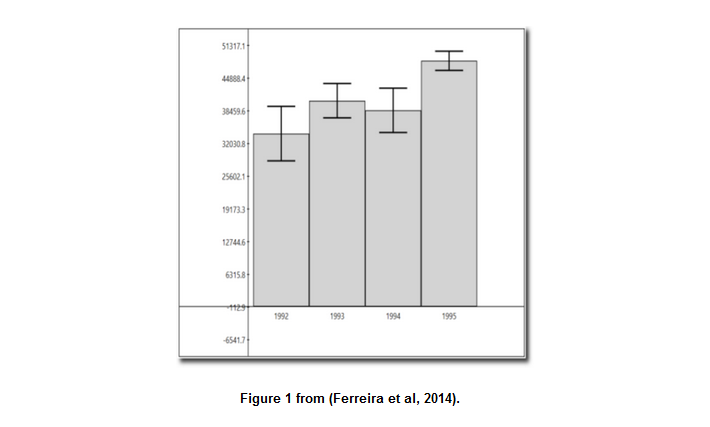
In this paper the authors describe the challenges users face when trying to make judgements about probabilistic data generated through samples. As an example, they look at a bar chart of four years of data (replicated below in Figure 1). Each year has a y-axis value, which is derived from a sample of a larger dataset. For instance, the first value might be the number votes in a given district or riding for 1992, with the average being around 33,000. On top of this is plotted the 95% confidence interval for the mean (see the boxplot lectures for more information, and the yerr parameter of barcharts).

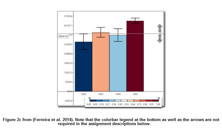
A challenge that users face is that, for a given y-axis value (e.g. 42,000), it is difficult to know which x-axis values are most likely to be representative, because the confidence levels overlap and their distributions are different (the lengths of the confidence interval bars are unequal). One of the solutions the authors propose for this problem (Figure 2c) is to allow users to indicate the y-axis value of interest (e.g. 42,000) and then draw a horizontal line and color bars based on this value. So bars might be colored red if they are definitely above this value (given the confidence interval), blue if they are definitely below this value, or white if they contain this value.

Easiest option: Implement the bar coloring as described above - a color scale with only three colors, (e.g. blue, white, and red). Assume the user provides the y axis value of interest as a parameter or variable.
Harder option: Implement the bar coloring as described in the paper, where the color of the bar is actually based on the amount of data covered (e.g. a gradient ranging from dark blue for the distribution being certainly below this y-axis, to white if the value is certainly contained, to dark red if the value is certainly not contained as the distribution is above the axis).
Even Harder option: Add interactivity to the above, which allows the user to click on the y axis to set the value of interest. The bar colors should change with respect to what value the user has selected.
Hardest option: Allow the user to interactively set a range of y values they are interested in, and recolor based on this (e.g. a y-axis band, see the paper for more details).
Note: The data given for this assignment is not the same as the data used in the article and as a result the visualizations may look a little different.
1 | import pandas as pd |
1 | import pandas as pd |